Fort Payne City Branding / Interface
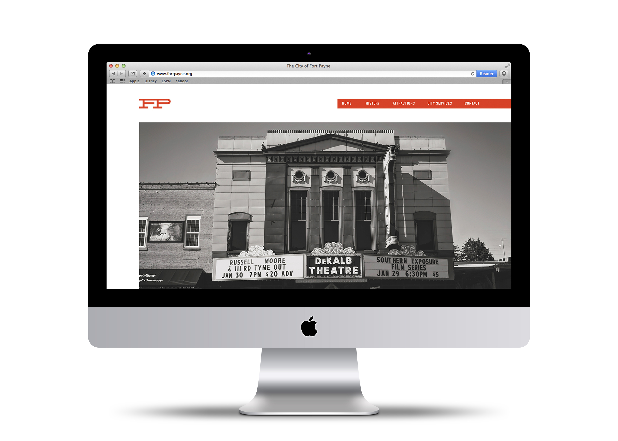
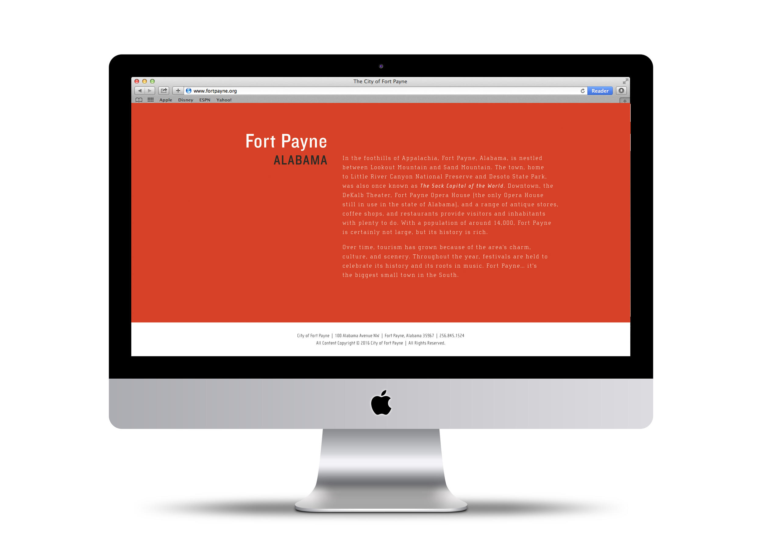
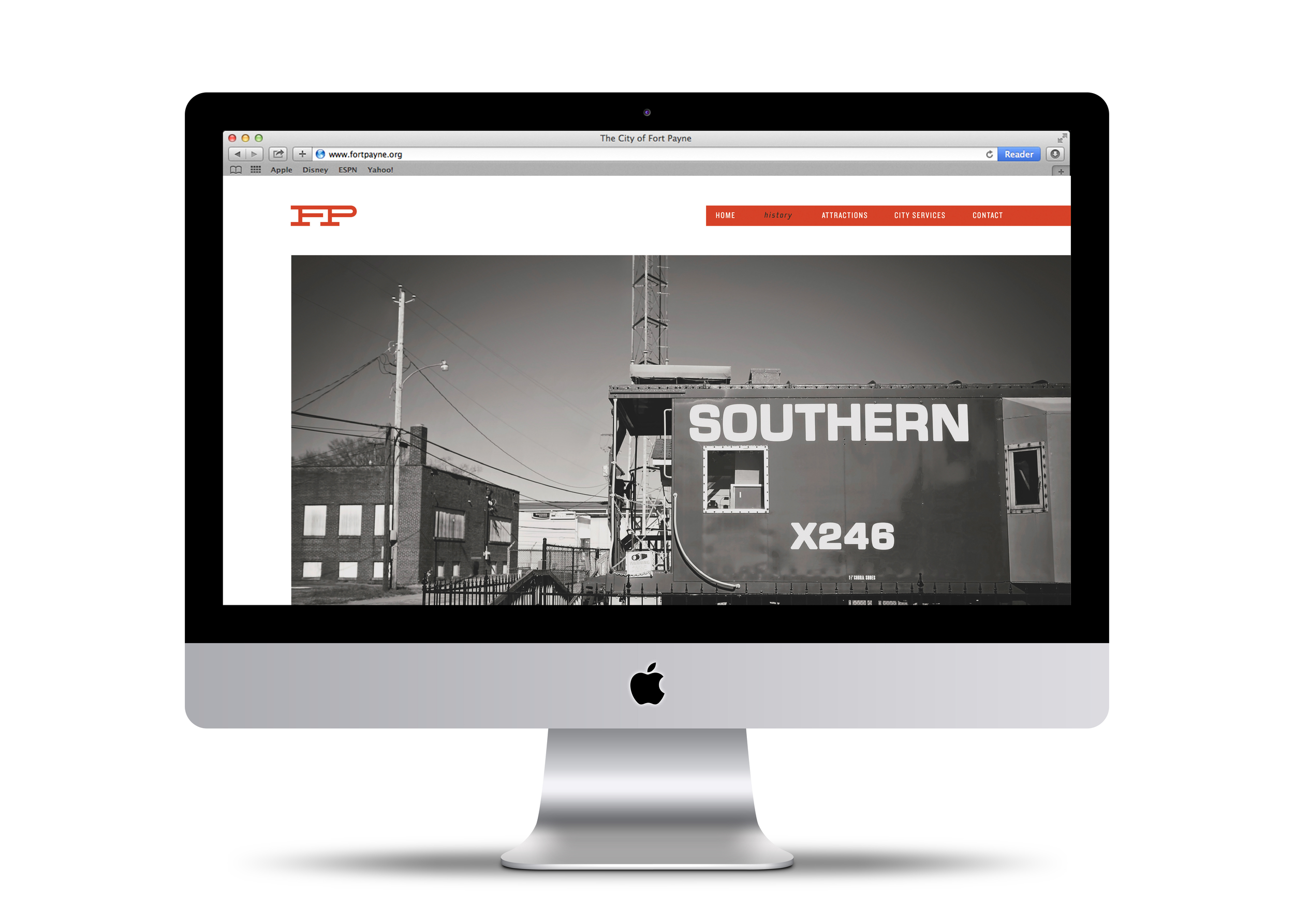
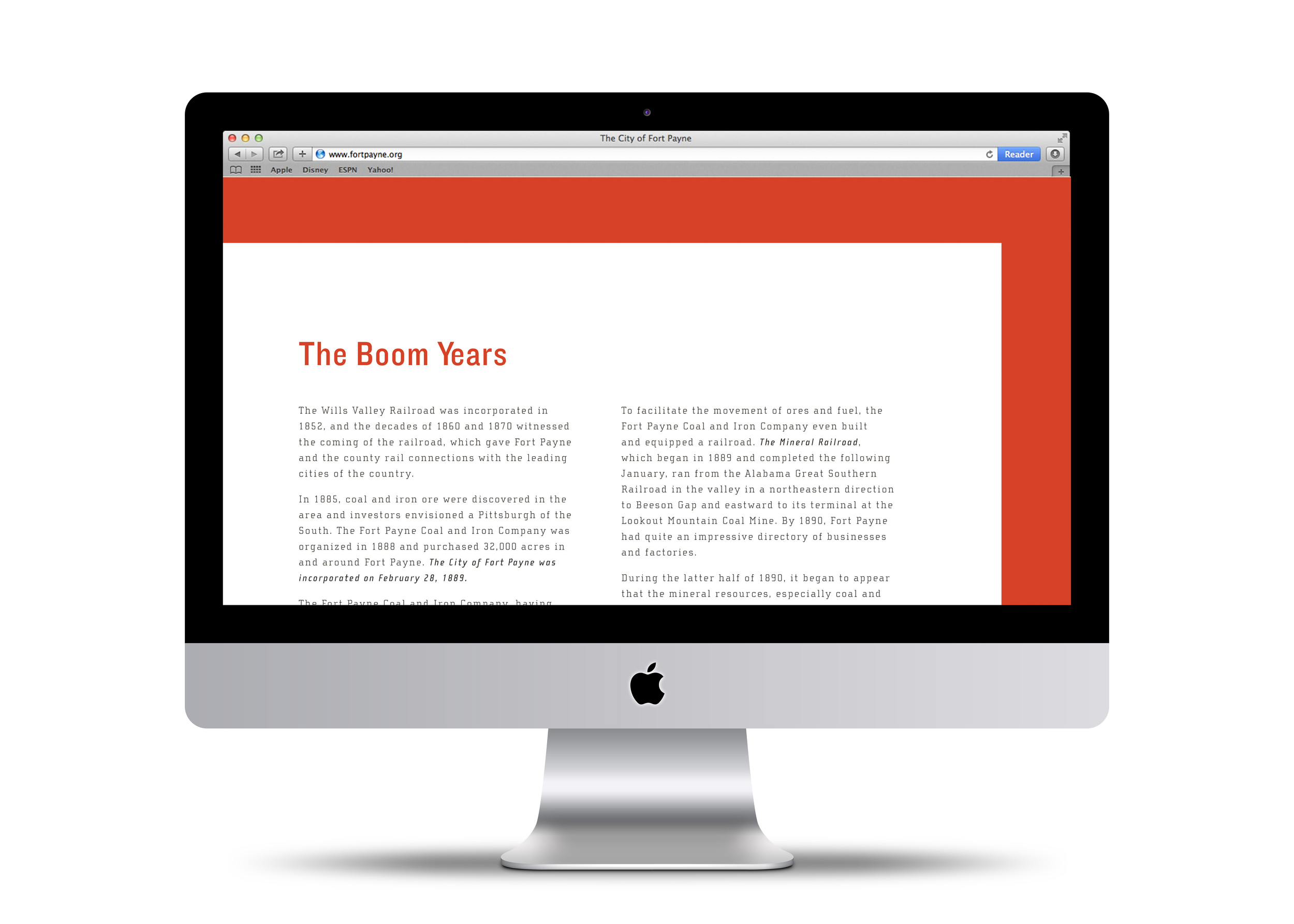
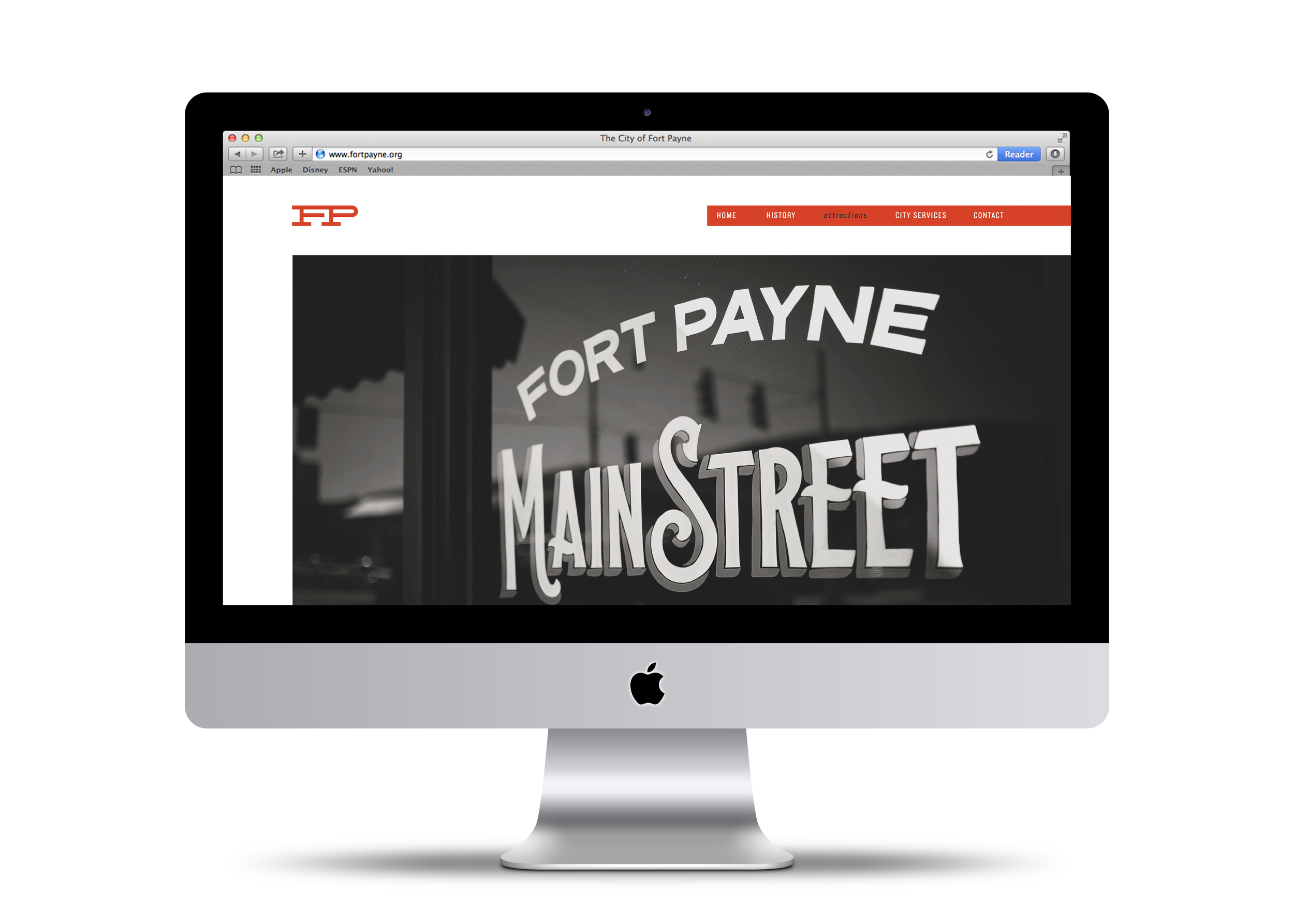
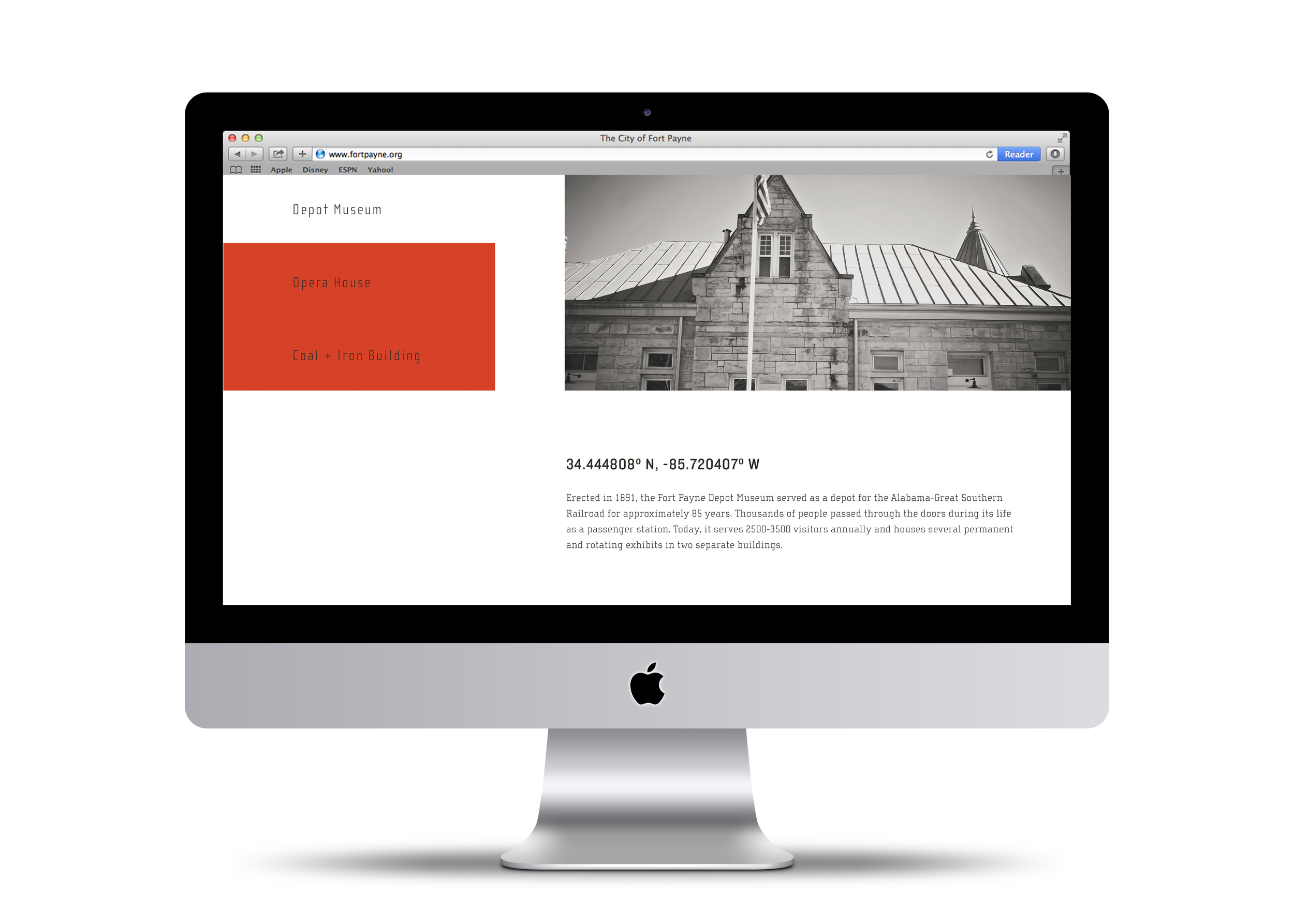
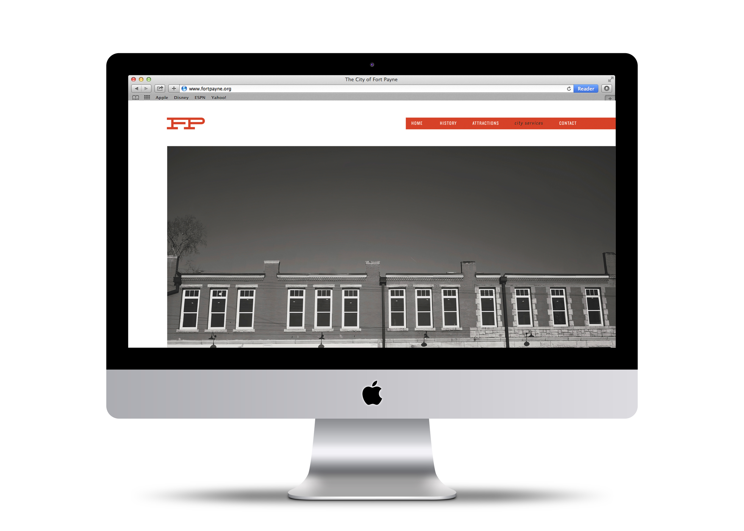
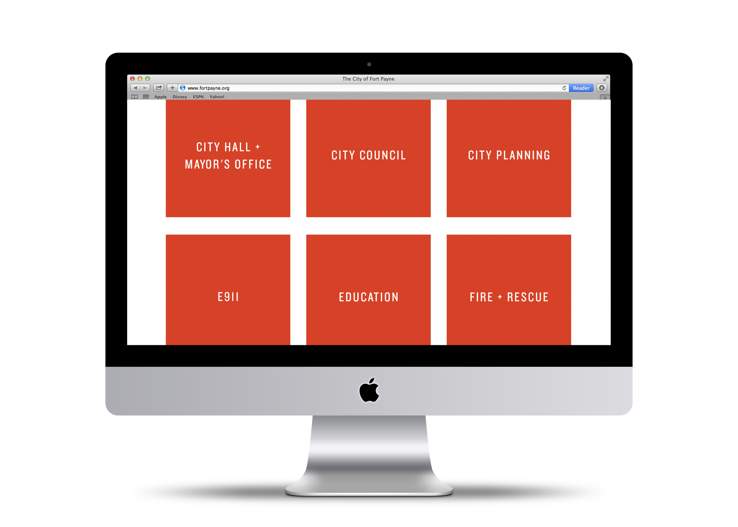
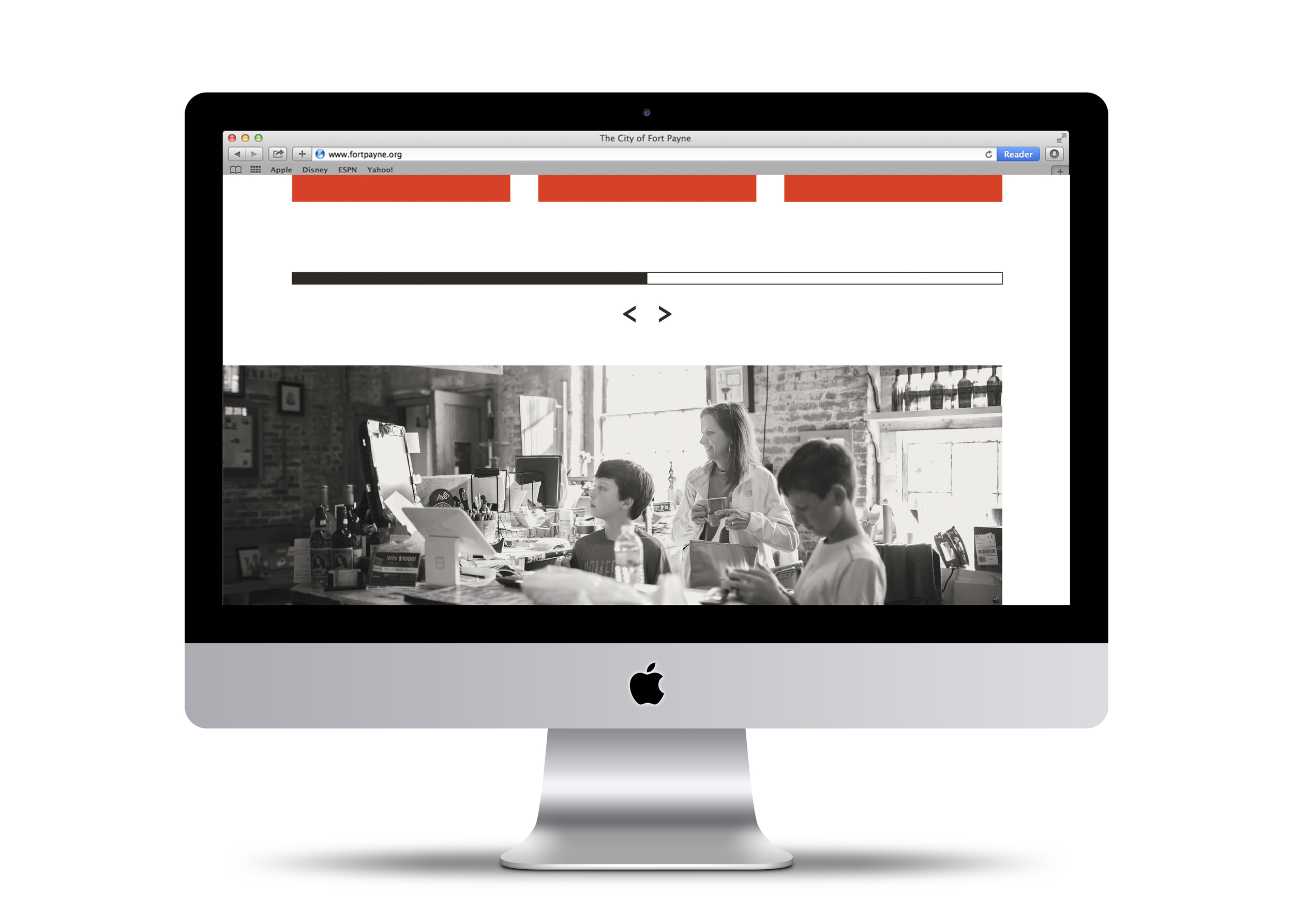
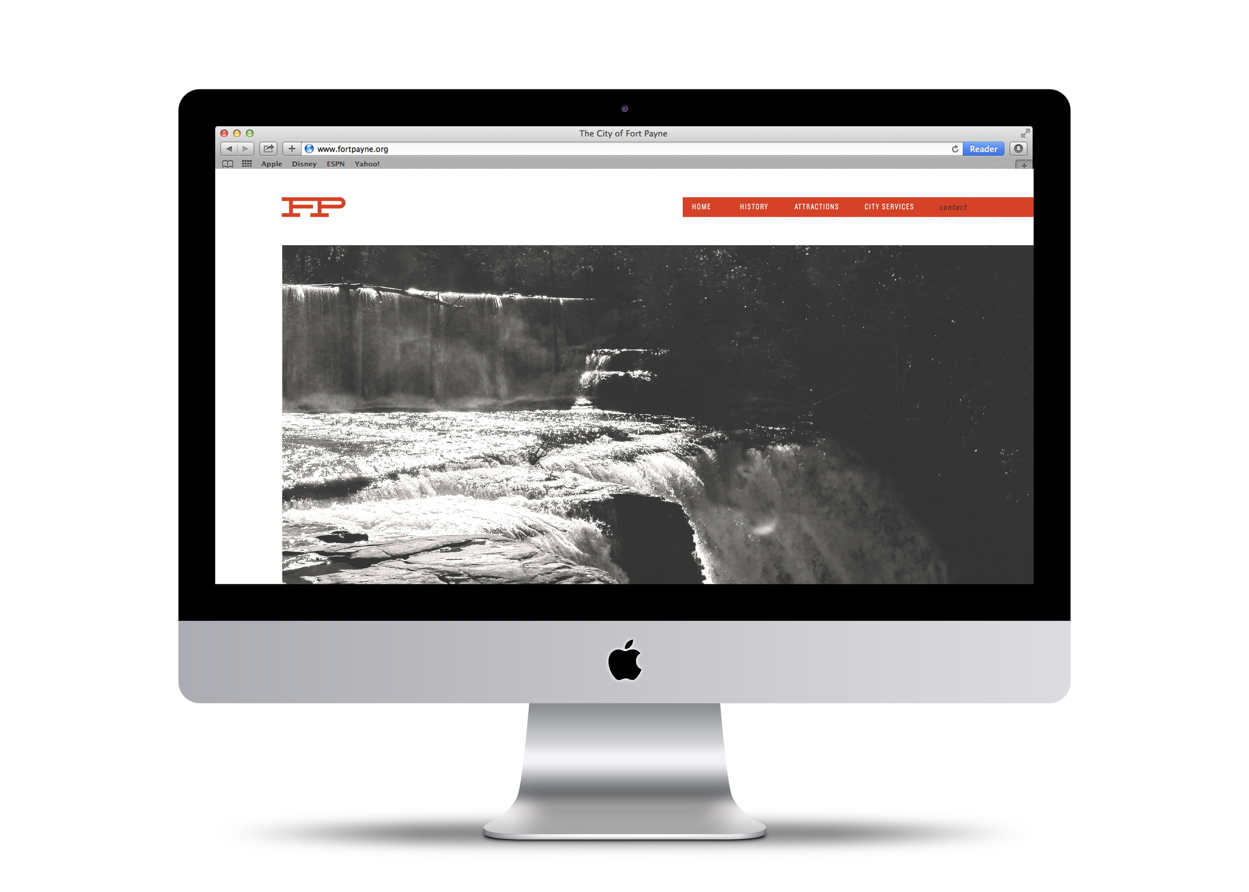
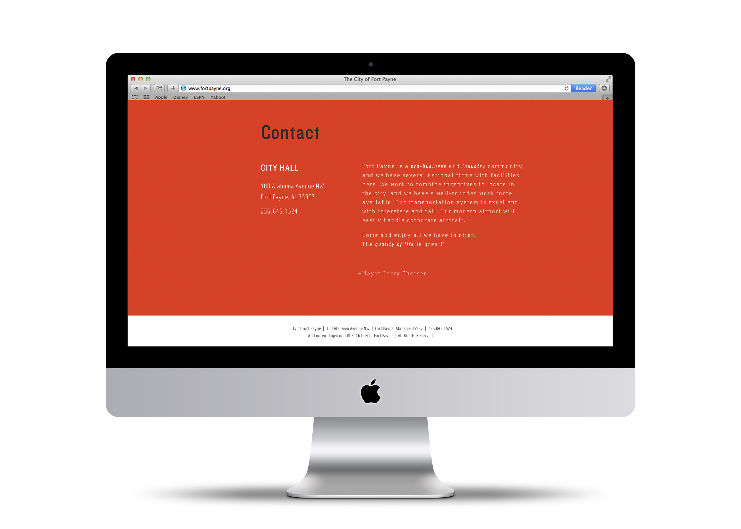
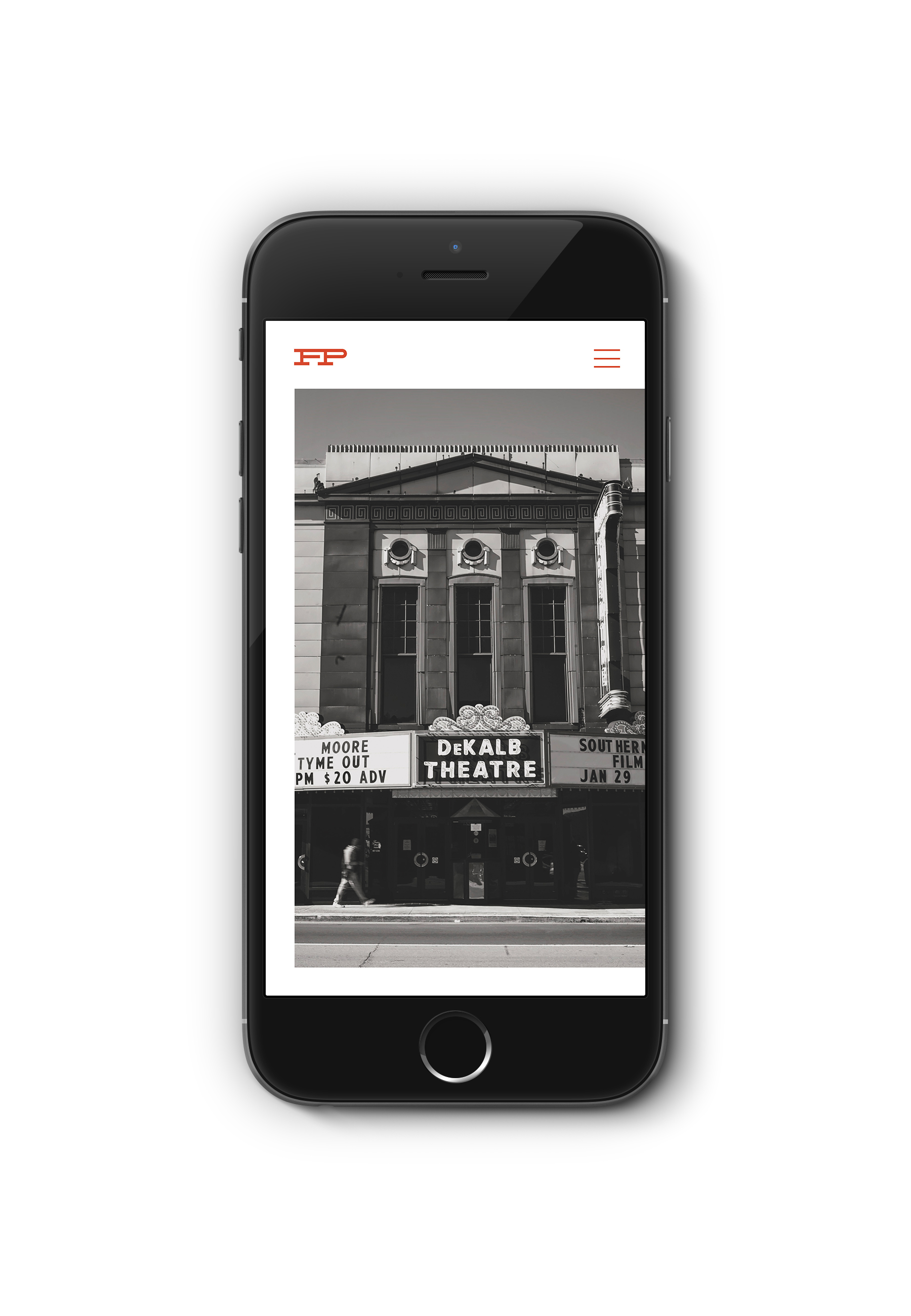
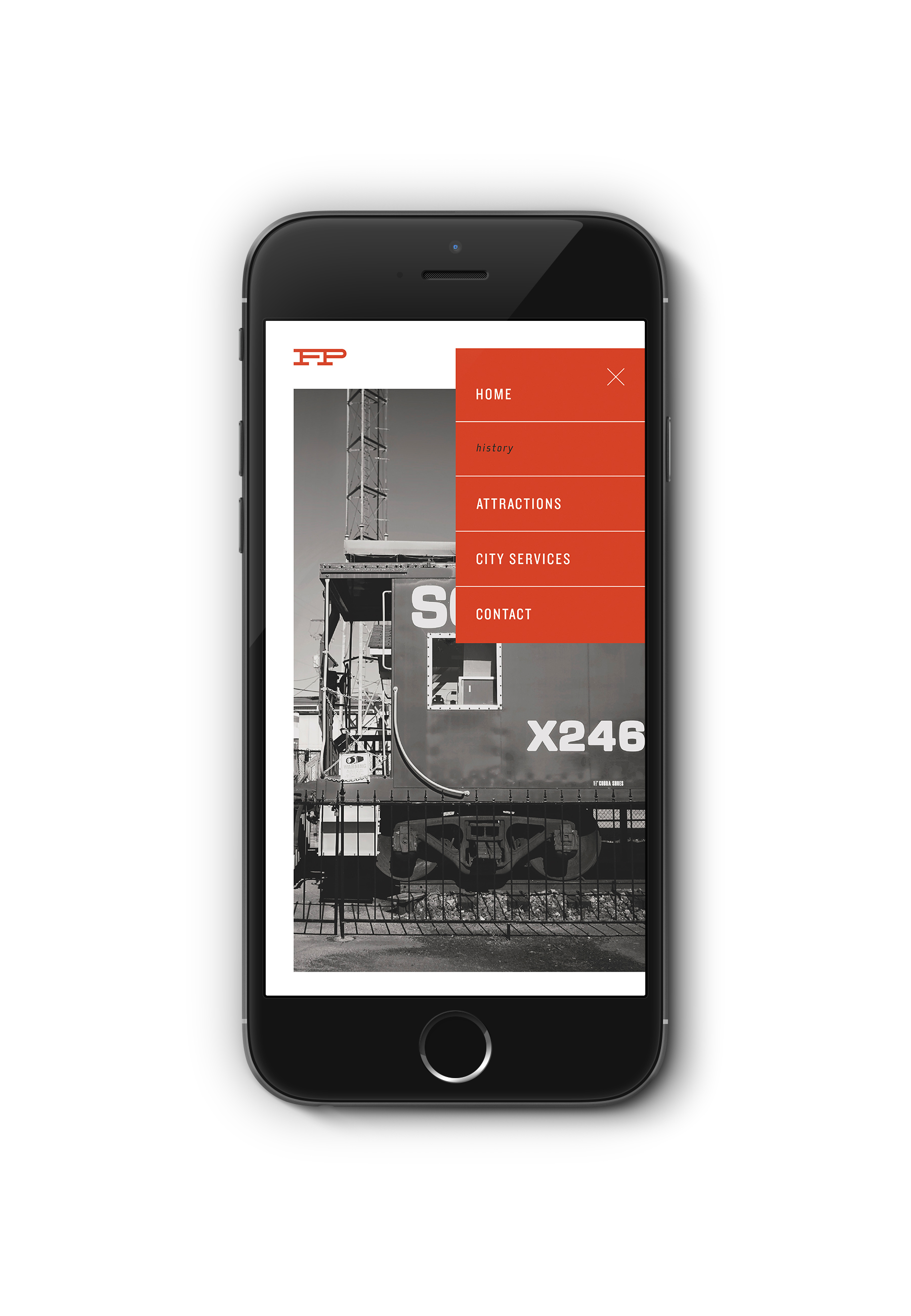
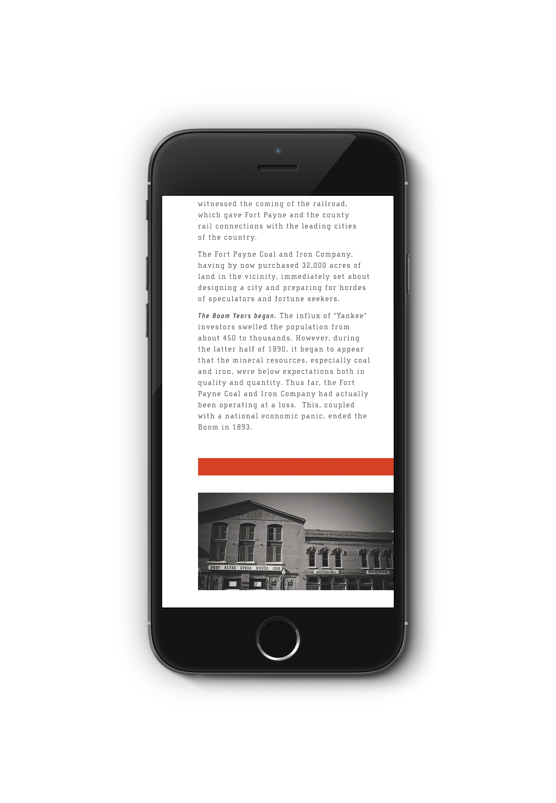
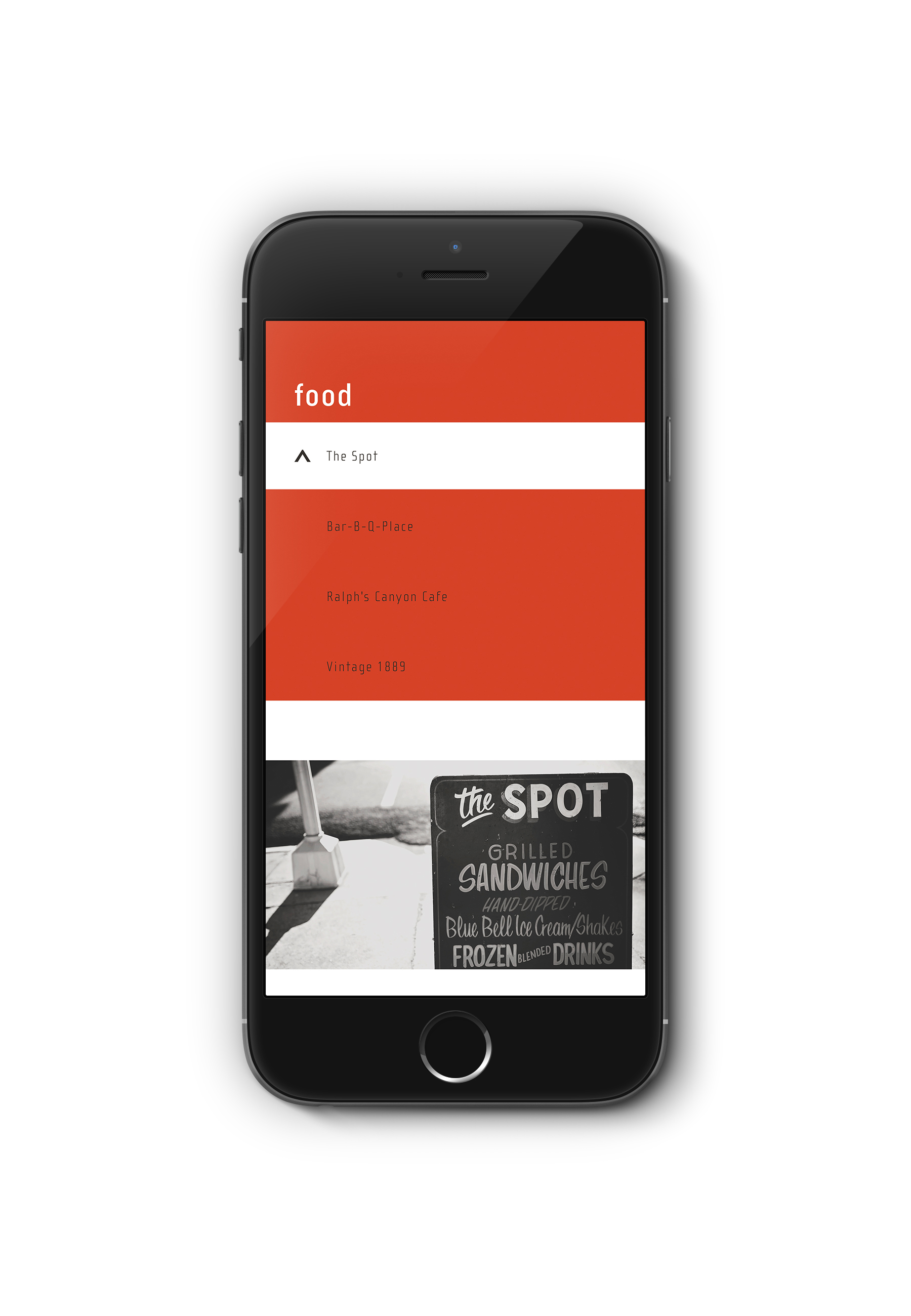
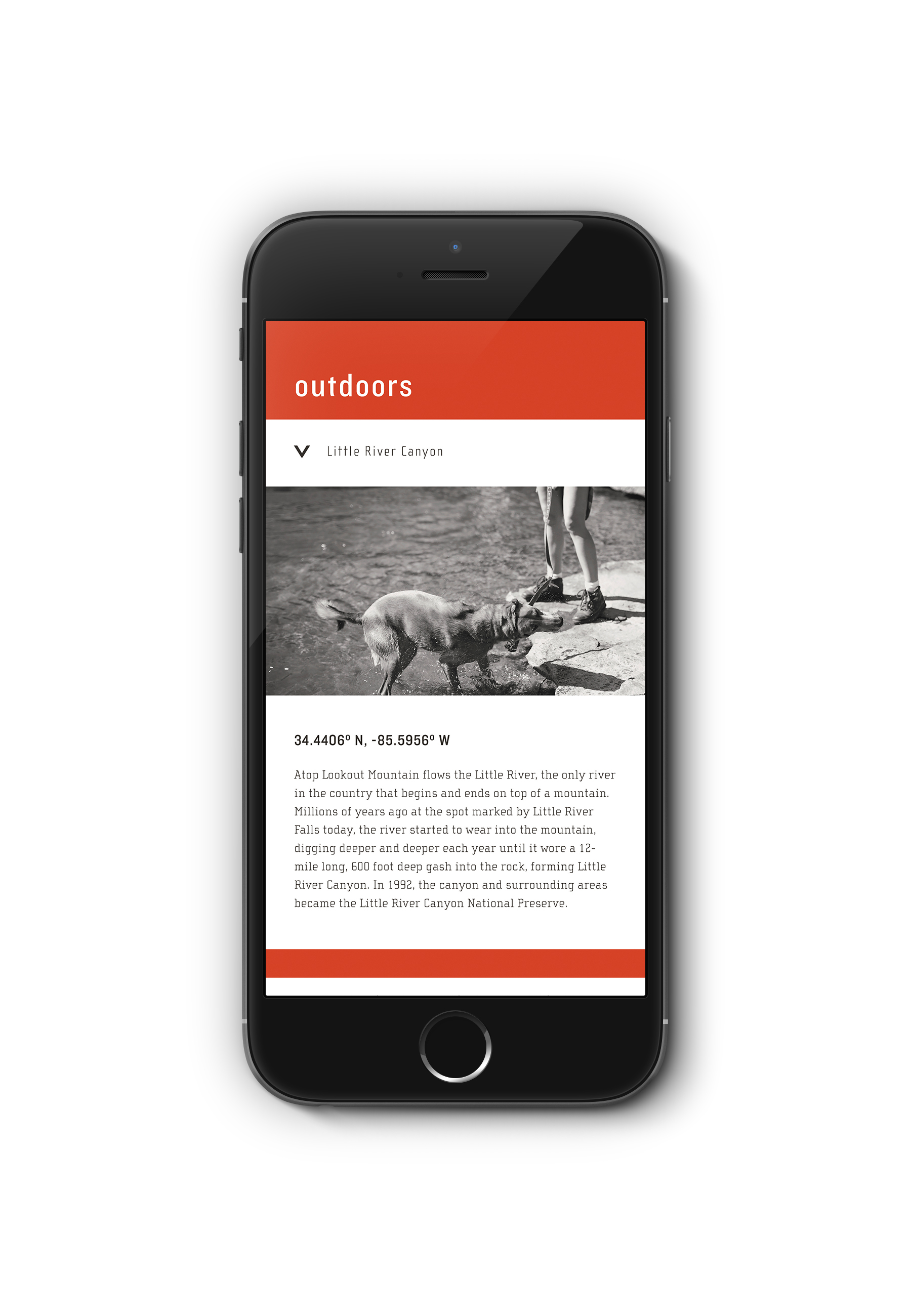
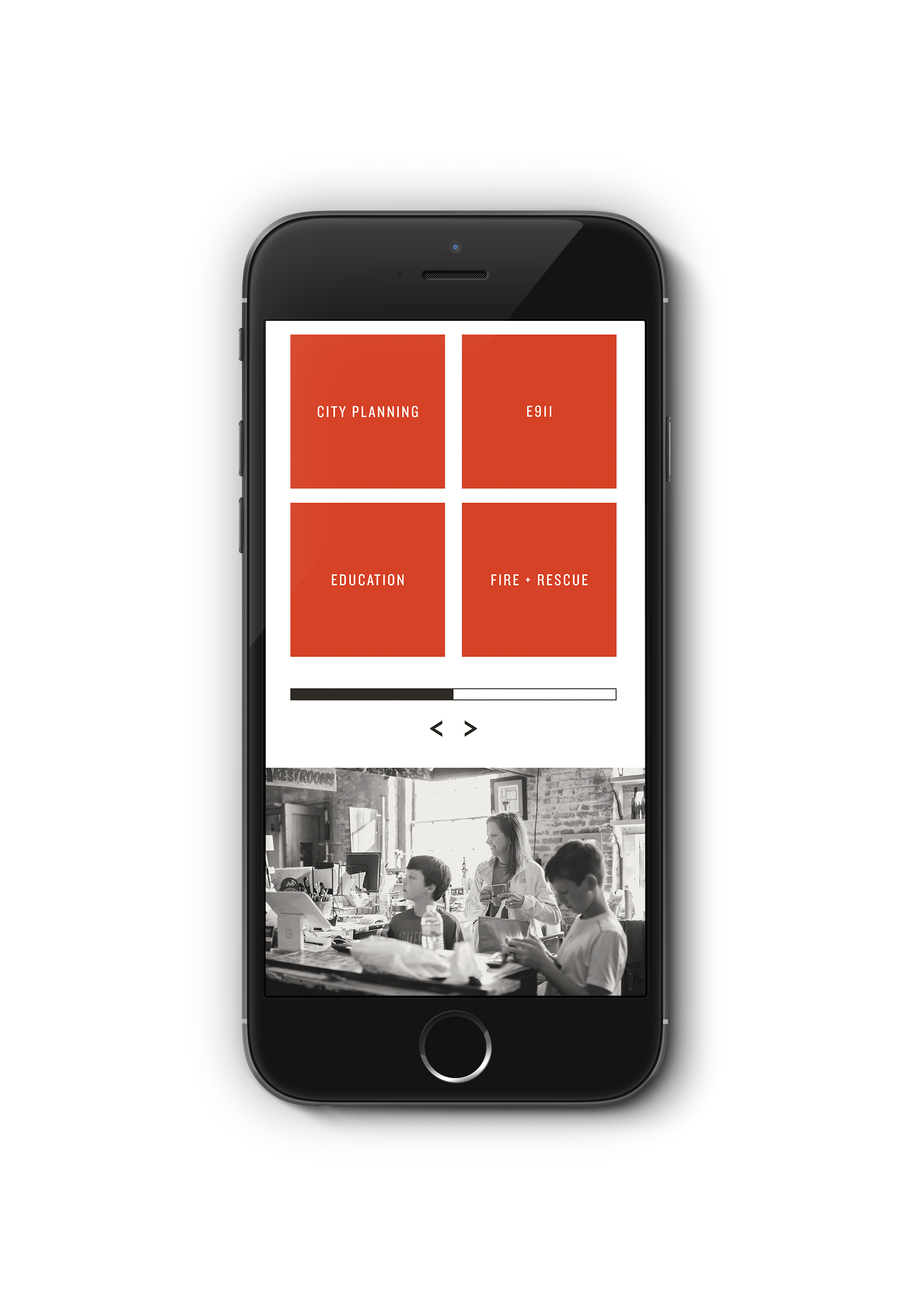
Objective: Design a responsive web interface that implements the branding of Fort Payne.
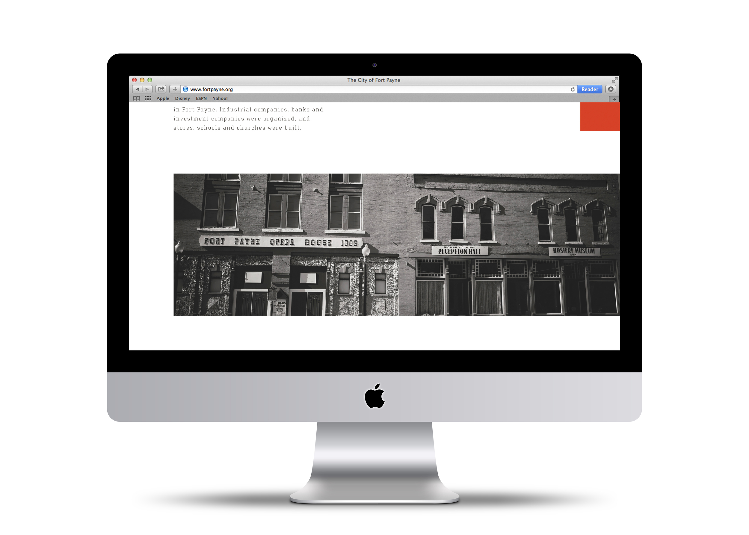
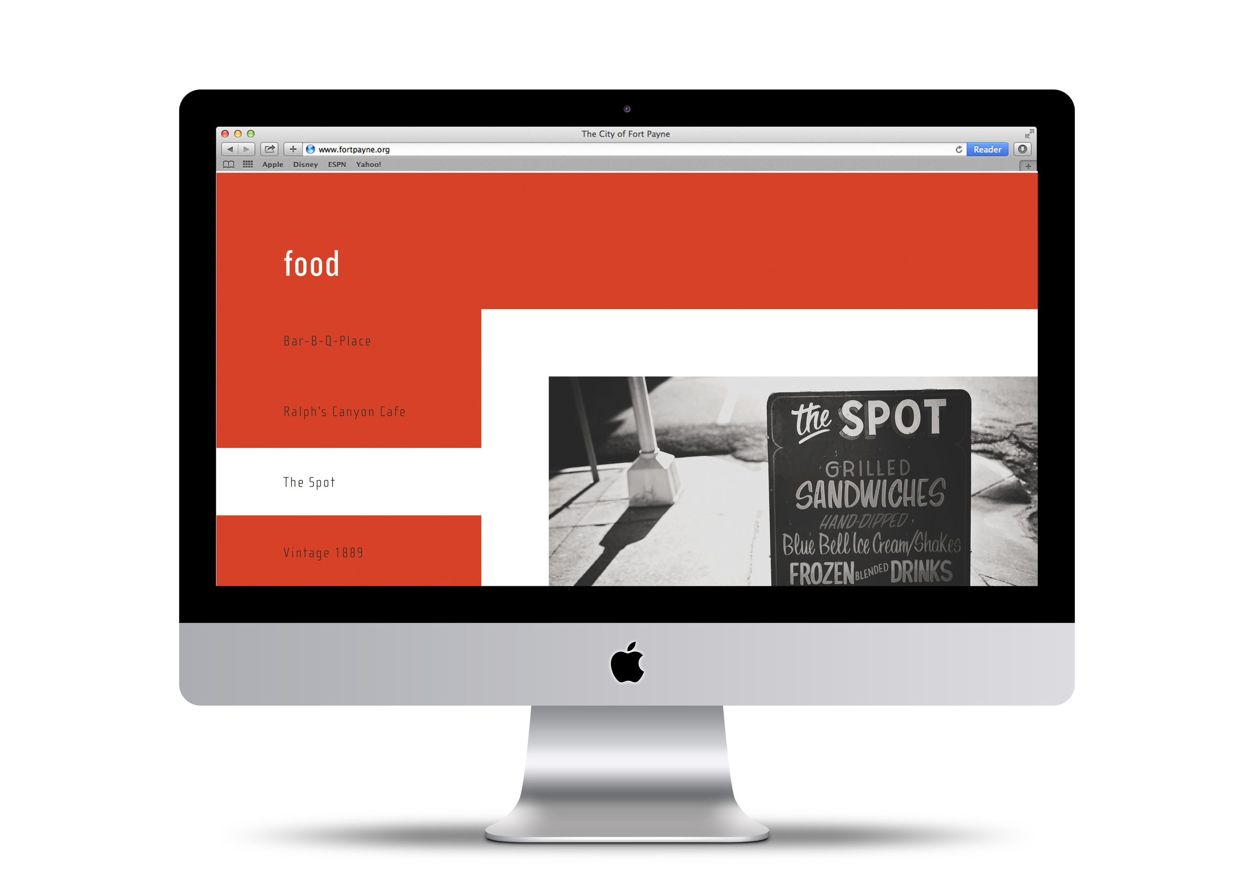
In order to carry-out the clean, modern approach of the branding, the website invites the user to navigate through its pages much like he/she would the actual town. This is encouraged by the use of orange and white lines that lead the user down scrolling pages. These lines relate to the aerial map and to the logo itself. In addition, the soft black and white photography is as prominent on the webpages as it is in the advertisements, signage, and printed materials.
All imagery of Fort Payne taken by Kayla Cobb
Work completed while a student at Auburn University / Art Direction, Samantha Herbert, Wei Wang, Carlton Nell
