Fists Full Designs
Objective: Develop an identity for a floral design company.
The tone of the company should be professional, delicate, and approachable.
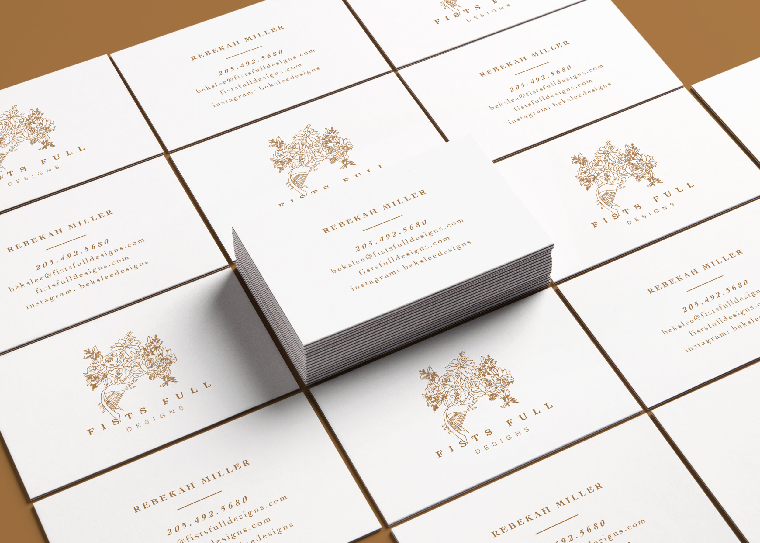
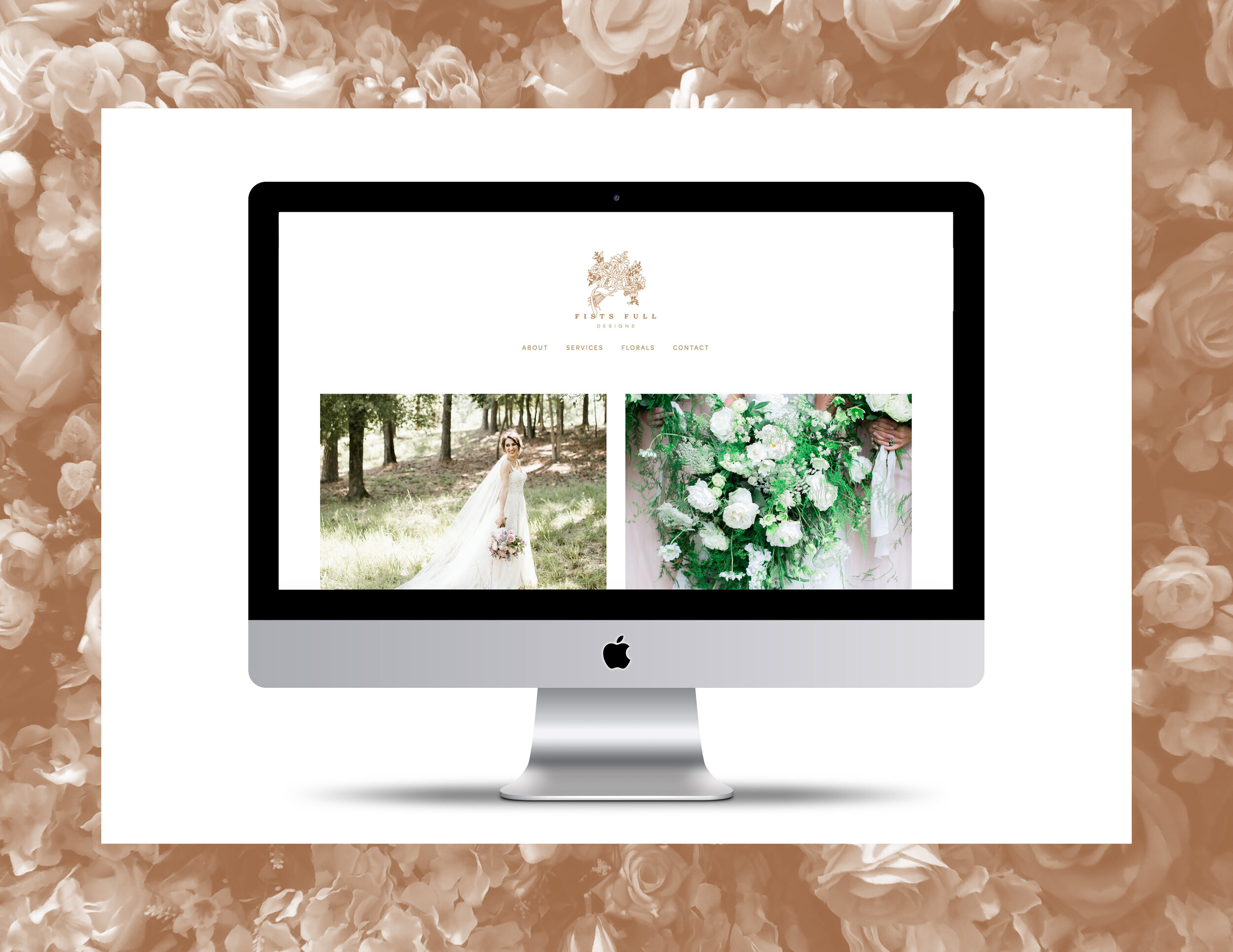
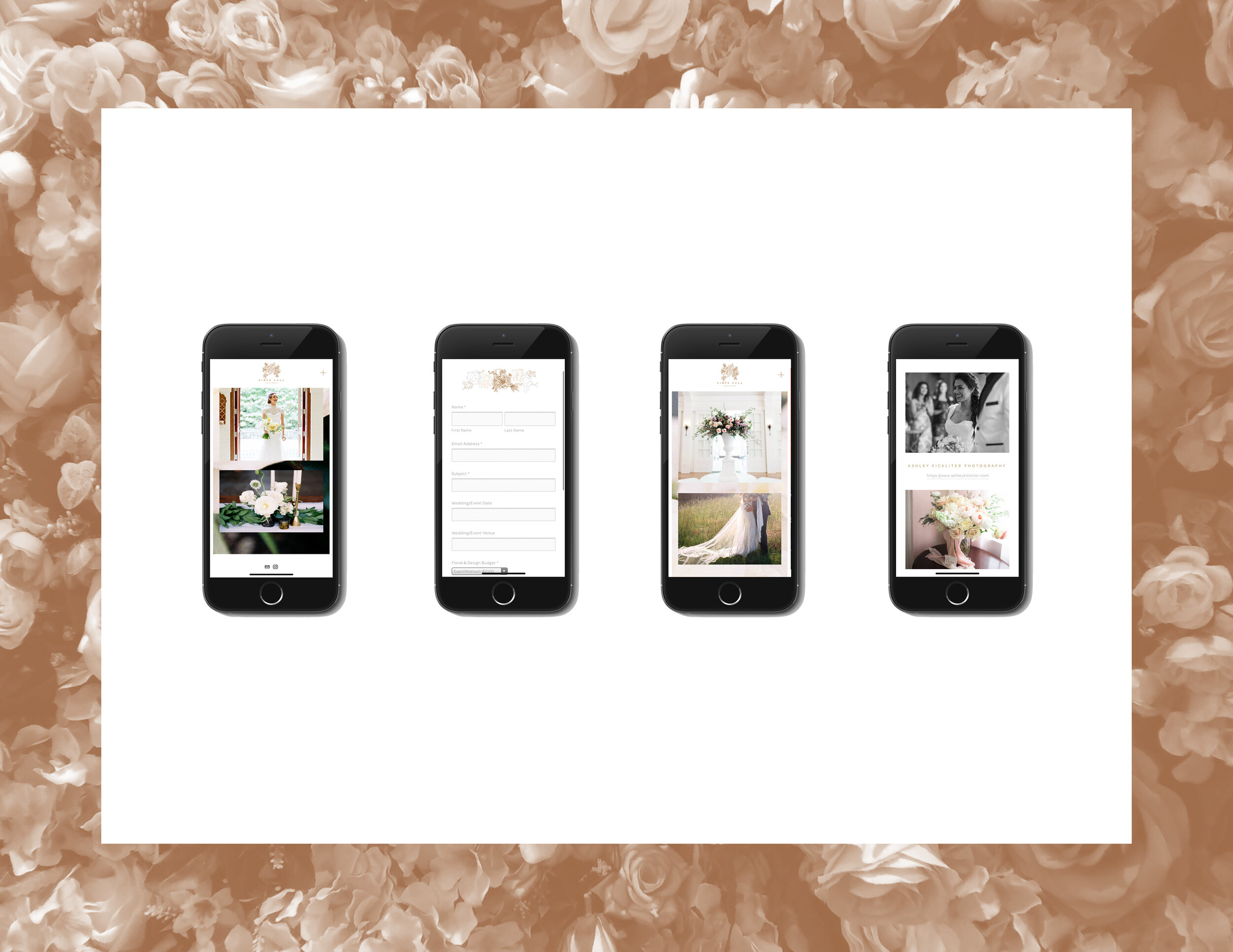
In the logo itself, a hand-drawn sketch was integrated with a slightly “barbed” serif font (a nod to all-too-familiar thorns) and a more sleek sans serif. Although the designer’s style was artfully playful and wild, she still wanted to convey a sense of refinement and professionalism. An earthy, deep champagne brought out tones within her arrangements as well as ones found in candlesticks, flatware, and decor often found around them. The charming sketches are carried throughout the business cards and website.
Work completed in Spring 2017